
Uncategorized
Best Sticker Finishes for Branding
22
May
May
A sticker can look cheap before anyone reads a word on it. That is usually not the artwork’s fault. It is the finish.
Choosing the best sticker finishes for branding comes down to one simple question – what do you want people to feel when they see it and how hard is that sticker going to work? A slick retail label, a tradie ute decal, an event handout and a premium product seal do not need the same surface. Get the finish right and your brand looks sharp, intentional and worth remembering. Get it wrong and even a strong logo can fall flat.
What the best sticker finishes for branding actually do
Sticker finish is not just a cosmetic extra. It changes how colour shows up, how light hits the surface, how premium the sticker feels in hand and how well it handles scratches, moisture and daily wear.
That matters because branding is rarely seen in ideal conditions. Your sticker might end up on a laptop, water bottle, shop counter, packaging box, hard hat or car window. Some finishes make colours pop. Some cut glare. Some hide fingerprints better. Some are built to cop more punishment without looking tired after a week.
So if you are picking a finish based only on what looks good on screen, you are missing half the job.
Gloss finish – bold, bright and built to stand out
If you want instant visual punch, gloss is usually the first place to look. It reflects light, boosts contrast and makes colours look more saturated. For brands that lean bright, energetic or promotional, gloss does a lot of heavy lifting.
This finish works especially well for retail promos, giveaway stickers, food packaging, event branding and logos with strong colour blocks. If your design needs to grab attention fast, gloss tends to do that better than matte.
There is a trade-off, though. Gloss can produce glare under strong lighting, which may make smaller text or fine detail a bit harder to read in some settings. It also shows fingerprints and surface marks more easily than matte. For products handled often, that is worth thinking about.
Still, for plenty of businesses, gloss is the safe bet because it looks clean, polished and high-impact without overcomplicating the decision.
Best suited to
Gloss suits promotional stickers, packaging labels, colourful logos, bumper stickers and event stock where visibility matters more than subtlety.
Matte finish – clean, modern and more understated
Matte goes the other way. It softens reflection, reduces glare and creates a flatter, more refined look. If your brand sits in the premium, minimalist or contemporary lane, matte can look seriously good.
It is also practical. Matte is easier to read under bright lights, and it tends to hide fingerprints and minor scuffs better than gloss. That makes it a smart pick for product labels, coffee bags, cosmetics, candle packaging, folders, mailers and any sticker likely to be handled a lot.
The main compromise is colour intensity. Matte does not bounce light around like gloss, so colours can appear a little more muted. That is not a problem if your branding is built around subtle tones or clean typography. But if your whole identity relies on bright, loud colour, matte may take a bit of edge off it.
For many brands, that softer look is exactly the point. Matte says considered, not shouty.
Clear finish – branding that feels built in, not stuck on
Clear stickers are a smart move when you want the print to blend into the surface rather than sit heavily on top of it. On glass, bottles, jars and windows, they can look tidy and professional with far less visual clutter than a standard white sticker.
This finish is popular with cafes, salons, breweries, retailers and event spaces because it gives branding a cleaner, more integrated look. It is especially effective when the application surface is part of the presentation, like a bottle, storefront or product container.
But clear is not automatic premium. It depends heavily on artwork. Pale colours, fine lines and low contrast can get lost, especially on dark or busy backgrounds. White ink can solve some of that, but the design needs to be planned properly.
If you want branding that feels subtle and polished, clear can be brilliant. If you need max legibility from a distance, it may not be your strongest option.
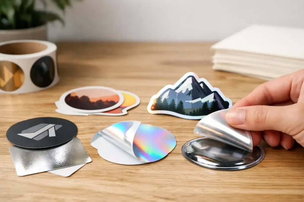
Holographic finish – high attention, high personality
Some brands want subtle. Others want people to stop mid-scroll or mid-step and say, that looks unreal. That is where holographic comes in.
Holographic stickers throw light, shift colour and create movement as the angle changes. They are made to get noticed. For artists, streetwear labels, music events, gaming brands, clubs, limited drops and creative packaging, that extra impact can be a huge asset.
It is not for every brand, and that is the point. Holographic is a style choice, not a neutral one. It can overpower fine details, and it may clash with more conservative or corporate branding. If your business depends on traditional trust signals, a flashy finish could send the wrong message.
But if your brand is playful, bold or built for collectability, holographic can turn a standard sticker into something people actually want to keep.
Satin or semi-gloss – the middle ground that often wins
Not every branding decision needs to be extreme. Sometimes you want some colour lift without full shine, or a smoother premium look without a dead-flat matte feel. That is where satin or semi-gloss style finishes make sense.
This option gives you a balanced result – less glare than gloss, more vibrancy than matte. It works well for business branding that needs to look professional but not sterile. Think product labels, promotional handouts, internal brand packs and stickers that need broad appeal across different audiences.
It is often the practical compromise for businesses that want a finish everyone can agree on. Not flashy, not plain. Just solid.
Matching the finish to the job
The best sticker finishes for branding depend on where the sticker is going, how long it needs to last and what role it plays in your brand system.
For outdoor use, surface durability matters as much as looks. A glossy laminated sticker on a vehicle or outdoor sign may hold up better against moisture and abrasion than an uncoated option. For packaging, the feel in hand matters more. Matte can elevate a label even if it never sees rain. For event giveaways, visual impact and cost efficiency usually matter most, which is why gloss is so common.
You also need to think about brand fit. A mortgage broker, boutique gin label, local council event and motocross club are not chasing the same reaction. Good branding is not about picking the fanciest finish. It is about choosing the finish that makes your message feel right.
A quick reality check on budget and volume
Finishes affect cost, but not always in the way people expect. Standard gloss and matte are usually straightforward choices for most orders. Specialty finishes like holographic or certain clear applications can cost more because they require more specific materials or production considerations.
That does not mean the premium option is poor value. If a standout finish helps a sticker get kept, shared or noticed longer, it can easily earn its place. But if you are ordering in bulk for a short campaign or large giveaway, a standard finish may give you better overall return.
This is where it pays to be honest about the job. If the sticker is there to drive awareness fast and wide, keep it simple. If it is part of a premium product experience, the finish deserves more thought.
How to choose without overthinking it
If your brand is bright, youthful or promo-heavy, start with gloss. If it is premium, minimalist or text-driven, start with matte. If the surface underneath matters, look at clear. If attention is the whole game, holographic can do the heavy lifting.
Then pressure-test that choice against real use. Will it be handled often? Used outdoors? Applied to glass? Seen under harsh lighting? Sent out with premium products? The finish should support the sticker’s job, not just the artwork.
And if you are torn between two options, that usually means both could work. At that point, the smarter question is not which one is objectively better. It is which one feels more like your brand when someone sees it for the first time.
That first impression is doing more work than most businesses realise. A good sticker does not just carry your logo. It carries your standards.
If you want branding that looks sharp straight out of the box and still holds up in the real world, the finish is not the last detail. It is one of the first decisions worth getting right.