
Uncategorized
Clear vs White Sticker Stock
27
Jun
Jun
A sticker can look premium on screen, then land flat in real life because the stock was wrong from the start. That is why clear vs white sticker stock matters more than most people think. The choice changes how your colours print, how easy your message is to read, and whether the finished sticker feels polished or a bit off.
If you are ordering for product labels, event promos, trades, real estate, or branded merch, this is not a small detail. It is one of the biggest design decisions in the whole job. Get it right and your sticker looks intentional. Get it wrong and even a great logo can lose impact.
Clear vs white sticker stock: what is the actual difference?
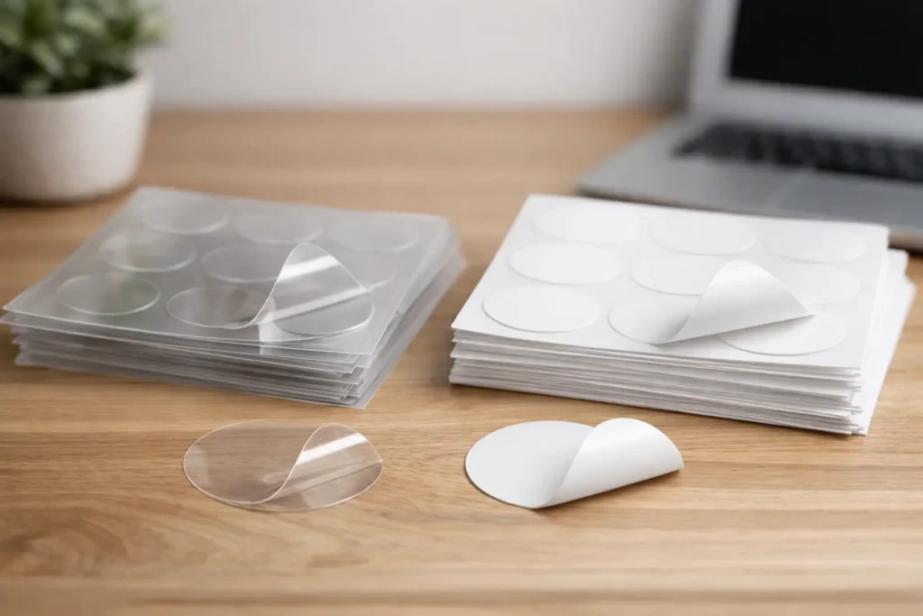
White sticker stock gives you a solid white base under the entire print. That means your artwork starts on an opaque surface, so colours stay strong, text stays readable, and fine detail usually comes out clean and consistent. It is the safe pick for most businesses because it behaves exactly how people expect a printed sticker to behave.
Clear sticker stock is transparent. Any part of the design without ink will show the surface underneath. That can look seriously good when used well. It can also create problems if the surface colour behind the sticker interferes with your artwork.
This is the part people miss – clear stock does not just change the background. It changes how the whole design is perceived. A logo printed on clear stock for a white window can look crisp and modern. The same sticker applied to a dark esky, tinted glass, or coloured bottle can suddenly lose contrast and readability.
When white sticker stock is the better call
White stock is the workhorse. If you want bold branding, strong colour, and easy readability, it is usually the best option.
It works especially well for logos with light colours, detailed illustrations, small text, QR codes, product labels, and promo stickers that need to be seen quickly. If your sticker is going onto mixed surfaces and you cannot control the background colour, white stock gives you consistency. That matters when your stickers are heading to customers, job sites, shopfronts, market stalls, or event packs.
White stock also tends to feel more direct. It says what it needs to say without relying on the application surface to complete the look. For trades, retail, food packaging, community clubs, and campaign material, that reliability is gold.
There is also a practical budget angle. If your design needs strong whites, pastel tones, or clean colour reproduction, white stock keeps things straightforward. You are not fighting the substrate underneath, and that usually makes approval easier because what you see in the proof is closer to what you will get in the final result.
When clear sticker stock looks better
Clear stock shines when you want the sticker to blend into the surface rather than sit on top of it. It is popular for glass, jars, bottles, cosmetic packaging, café containers, and slick branded applications where you want a cleaner, less obvious label edge.
Done properly, clear stock can look sharp, minimal, and expensive. It is a smart option when the surface itself is part of the presentation. Think window decals, drink bottles, candle jars, or product packaging where you want the contents or material behind the label to stay visible.
It is also handy when you want a no-fuss look. A well-designed clear sticker can make branding feel built in rather than added later. For some premium brands, that is exactly the point.
But clear stock needs more care. If your design has pale colours, thin lines, or small type, transparency can work against you. You need enough contrast for the artwork to hold up on the final surface, not just in the design file.
The biggest mistake with clear stock
People often choose clear stock because it sounds more premium, then send artwork designed for white stock. That is where things go sideways.
On a white background in a PDF, everything can look perfect. On a clear sticker applied to a coloured or dark surface, colours may appear softer and some elements can nearly disappear. White ink can solve part of that in some print setups, but that depends on the job and the intended effect. Either way, clear stock usually needs more deliberate artwork planning.
If the sticker has to work on multiple surfaces, clear can become risky fast. A transparent background on one product may look polished. On another, it may look like the design is floating with half the information missing.
Design considerations that actually matter
The stock choice should come after one simple question – where is this sticker going, and what does it need to do?
If the job is all about visibility, white stock usually wins. If the job is all about blending in and keeping the underlying surface visible, clear stock is the better fit.
Colour is a big factor. On white stock, colours generally print with more punch because they sit on an opaque base. On clear stock, the background can affect how colours appear. Bright artwork on a dark surface can lose energy. Light greys, yellows, soft blues, and skin tones are especially worth checking.
Text is another one. If customers need to read ingredients, instructions, contact details, or a promo message quickly, white stock is often the safer option. Clear stock can still work, but only if contrast is carefully managed.
Then there is the sticker edge. White stock gives you a visible shape, which can be useful if the sticker itself is part of the design. Clear stock reduces that framed look, especially on glass or smooth packaging, which can feel more refined.
Clear vs white sticker stock for common uses
For product labels, it depends on the brand look. If you want bold shelf presence, white stock gives stronger impact. If you want a clean-label or premium-packaging feel, clear stock can look excellent on the right container.
For shop windows and glass doors, clear stock is a popular choice because it lets the glass remain part of the finish. That said, white stock is often better when the message needs to be read from a distance or against changing backgrounds.
For outdoor promo stickers, bumper stickers, and general branding, white stock is usually the safer all-rounder. It gives better visibility and more predictable results across different surfaces.
For bottles, jars, and candles, clear stock can be a standout if the design is minimal and the container colour works with the artwork. If the label carries lots of information, white stock often makes life easier.
For events, markets, and fast-turnaround promo jobs, white stock keeps the guesswork down. When deadlines are tight, simple is good.
Which stock feels more premium?
This is where it depends.
Clear stock can absolutely look more premium when the design is built for it and the application surface is right. It has that clean, modern finish people often associate with boutique products and polished branding.
White stock can look just as premium when the artwork is bold, the print is sharp, and the finish suits the brand. Plenty of luxury labels, high-end product stickers, and polished promotional pieces use white stock because it delivers richer colour and stronger contrast.
Premium is not about picking the fancier-sounding material. It is about choosing the stock that makes the artwork look intentional.
How to choose without overthinking it
If you want the easiest path to a strong result, choose white stock when readability, colour strength, and consistency matter most. It is the dependable option and the best fit for a huge range of business uses.
Choose clear stock when the surface underneath is part of the visual idea and you are happy to design around transparency. It can look brilliant, but it needs a bit more thought.
If you are stuck between the two, ask yourself what would be more annoying – losing the clean transparent look, or losing visibility in the actual use case? That answer usually points you in the right direction.
For most first-time orders, white stock is the safer bet. For brands with a specific packaging vision, clear stock can be the move that makes the whole piece feel more dialled in. That is why a sticker-first printer like Sticker Ninja will always look at the real-world application, not just the artwork file.
The best sticker is not the one that sounds coolest. It is the one that still looks spot-on once it is stuck, seen, handled, and judged in the wild.