
Uncategorized
Custom Sticker Sizing Guide That Actually Helps
14
May
May
You can have a brilliant design, sharp artwork and premium vinyl, but if the size is off, the sticker still misses the mark. That is why a proper custom sticker sizing guide matters. Too small, and your logo disappears. Too big, and it looks clumsy, costs more than it should, or simply does not fit where you need it.
Most people do not need a lecture on millimetres. They need to know what size works on a laptop, a takeaway box, a hard hat, a shop window, a ute, or a product label. Fair enough. Sticker sizing should be practical, fast to understand, and easy to apply.
How to use this custom sticker sizing guide
Start with the job, not the number. A 50 mm sticker is not automatically the right choice just because it sounds standard. The right size depends on three things – where it is going, how far away it will be viewed from, and what needs to be readable.
If your sticker is mainly there to show off a logo on packaging, you can usually stay fairly compact. If it needs to be seen on a car door or handed out at an event, you may need more visual impact. If it includes fine text, sizing becomes less about preference and more about legibility.
A good rule is simple: the more information on the sticker, the more space it needs. Tiny stickers and tiny text are a bad combo. If your design includes a business name, phone number, web address, tagline and social handles, squeezing it all into a 40 mm circle is asking for trouble.
Common sticker sizes and what they suit
There is no single best size, but there are a few reliable ranges that work for most orders.
Small stickers, around 30 to 50 mm, are popular for logo seals, product packaging, candle jars, sample bags, thank you stickers and envelope branding. They are neat, cost-effective and easy to apply, but they are not ideal for detailed artwork or anything that needs to be read from a distance.
Medium stickers, around 60 to 100 mm, are where a lot of businesses land. This size range works well for die cut logo stickers, laptop stickers, coffee cups, retail packaging, event handouts and general promotional use. It gives your design enough room to breathe without blowing out the budget.
Larger stickers, from 100 to 200 mm and beyond, are better for vehicles, windows, equipment, promotional displays and bold branding. These sizes make sense when visibility matters more than subtlety. They also suit simpler designs with strong contrast and fewer elements.
That said, bigger is not always better. A massive sticker on a small product can look awkward. It can wrinkle on curved surfaces, cover too much of the packaging, or feel more like a patch than a label.
Sizing by use case
Product labels and packaging
For jars, bottles, boxes and satchels, your sticker should fit the surface cleanly with a bit of breathing room around the edges. If the application area is 90 mm wide, a sticker around 70 to 80 mm often feels balanced. Going edge-to-edge can work, but it leaves less room for placement error and can look cramped.
Round labels tend to work well on lids and small containers, while rectangles and ovals are often easier on boxes and flat packaging. If your product label includes ingredients, directions or compliance details, do not choose size based on looks alone. Make sure customers can actually read it without squinting.
Laptop and promo stickers
For giveaway stickers, laptop decals and general brand merch, 70 to 90 mm is a sweet spot. Big enough to stand out, small enough to stick almost anywhere. This is the range many brands use for die cut stickers because it feels substantial without being over the top.
If your audience is likely to stick them on drink bottles, notebooks, helmets or toolboxes, keep shape in mind as well. A tall skinny design may look great on-screen but be harder to place in real life.
Car and bumper stickers
Bumper stickers usually need more width than height. Around 200 x 75 mm is a familiar format because it reads well on vehicles without swallowing the whole bumper. For smaller car decals, 100 to 150 mm wide can be plenty, depending on the message.
If the sticker is going on a rear window or ute canopy, think about viewing distance. A tiny logo may look tidy up close but disappear completely in traffic. Short messages, bold fonts and solid shapes perform better than busy artwork here.
Real estate and site stickers
For real estate boards, site signage, bins, helmets or equipment labels, the right size is usually driven by visibility and durability. These stickers often need to carry a logo, agency name, mobile number or safety message. That means clarity matters more than squeezing into a standard dimension.
In many cases, going slightly larger saves you from artwork compromises later. If details are critical, give them space.
Sticker sheets
Sticker sheets are a bit different because you are sizing both the sheet and the individual stickers on it. Smaller individual stickers work well when you want multiple logos, icons or labels on one sheet. Larger individual stickers make more sense if each design is meant to be peeled and used as a proper promo piece.
A common mistake is overloading the sheet with too many small pieces. It looks efficient, but if they are fiddly to peel or too tiny to appreciate, the value drops pretty quickly.
A custom sticker sizing guide for artwork and readability
Here is where sizing gets real. Your sticker size has to support your artwork, not fight it.
If your design is simple – say a logo mark or bold wordmark – you can often get away with a smaller sticker. If it includes fine outlines, gradients, tiny type or multiple brand elements, you need more room. Otherwise, the final print can look crowded, and the impact gets lost.
Text is usually the first thing to suffer. On screen, everything looks crisp because you are zoomed in. In print, especially on smaller stickers, text that seemed fine at design stage can end up unreadable. If the wording matters, increase the sticker size or simplify the design.
Shape affects this too. A square or rectangle gives you more usable area than a circle of the same width. Die cut shapes can look brilliant, but unusual outlines sometimes reduce the practical space for key details. If you are ordering a custom shape, make sure the important parts sit well inside the cut line.
Material and placement change the ideal size
Sticker size is not just about design. Surface matters.
Flat surfaces are forgiving. Curved surfaces are not. A sticker that looks perfect on a box may bubble or lift on a bottle if it is too large for the curve. Clear stickers can look sharp on glass, but if the design is too small and the contrast too subtle, they can disappear more than you want.
Holographic stickers are another one. They have strong visual energy, so they often work best when the design has enough area to show off the effect. Too small, and the finish can feel wasted. On the flip side, if the artwork is already very busy, a flashy material may need a slightly larger format to stay readable.
Outdoor use brings its own logic. If a sticker is going on a car, trailer, window or job site gear, size should account for distance, weather exposure and the fact that people rarely stand still to inspect it.
How to avoid ordering the wrong size
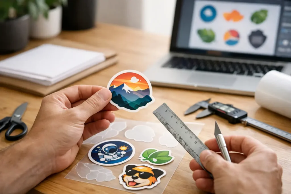
The easiest way to get sizing right is to test it in the real world before you print. Print your design on plain paper at actual size, cut it out, and place it where the sticker will go. Put it on the bottle, box, laptop, hard hat or bumper. Step back. Check the balance. See if the text still works.
This quick test picks up issues fast. You will notice if the logo feels tiny, if the shape looks awkward, or if the sticker crowds the surface. It is much better to spot that before production than after a full order lands.
It also helps to decide what the sticker is meant to do. If the goal is branding, prioritise visibility. If the goal is product information, prioritise readability. If it is for resale or merch, think about what feels good in the hand and worth sticking somewhere people actually care about.
When to size up and when to keep it tight
Size up if your sticker includes text, needs to be seen from a distance, uses detailed artwork, or is going on a larger surface. Extra space usually improves legibility and presence.
Keep it tight if the sticker is purely decorative, used as a seal, applied to small packaging, or intended as a subtle brand touch. Smaller stickers can look cleaner and cost less, especially in bulk.
This is the trade-off. Bigger stickers grab attention but use more material and can overpower the application. Smaller stickers are efficient and tidy but have less room to perform. The best choice is the one that matches the job, not the one that sounds safest.
If you are torn between two sizes, the smarter move is usually to compare them physically rather than guess. A few millimetres can change the whole feel of a sticker more than most people expect.
Good sticker sizing is not about memorising a chart. It is about making sure your artwork fits the surface, reads clearly and does the job first go. If that saves you from a reprint, wasted stock or a stack of stickers no one wants to use, that is a win worth having.