
Uncategorized
Custom Labels That Work Hard for Your Brand
30
Aug
Aug
A label might be small, but it does a big job. It has to catch the eye on a crowded shelf, survive a trip in a courier van, make stock easier to identify, and leave customers with a sharp impression of your business. Great custom labels are not just a logo stuck on a product. They are part of how your brand shows up in the real world.
For cafés bottling cold brew, tradies labelling tools, real estate teams preparing key packs, makers packing online orders and event organisers sorting hundreds of moving parts, the right label turns a loose end into a professional finish. Here is how to choose one that actually earns its place.
Custom labels should start with the job
Before picking a shape or getting carried away with shiny finishes, work out where the label will live and what it needs to handle. A label for a candle jar has a very different life from one on a ute, a takeaway container or a box travelling across Australia.
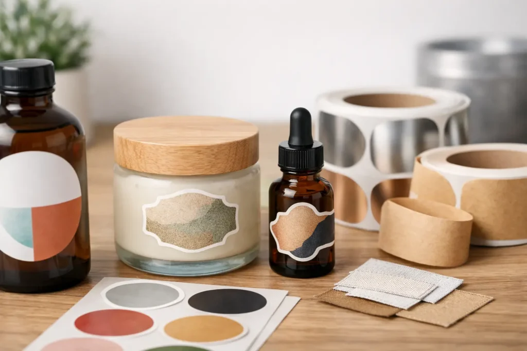
Think about the surface first. Smooth glass, coated cardboard, plastic tubs, metal tins and textured kraft stock all behave differently. A label that looks mint on a flat carton can wrinkle on a curved bottle. A tiny label may suit a spice jar, while a bigger front-facing label gives your product name, ingredients and personality room to breathe.
Then consider the environment. Will it face moisture, sun, fridge temperatures, handling, scuffs or a bit of all of the above? Indoor labels for short-term use can be simple. Outdoor, refrigerated or hard-wearing applications need more thought around material, adhesive and finish. The cheapest option is not always the best value if it peels, fades or looks tired before the job is done.
Choose a custom label material that suits real life
Paper-style labels can feel warm, natural and approachable, especially for handmade goods, food packaging, markets and boutique retail. They work beautifully when the product stays dry and is handled with reasonable care. They can also be a smart way to bring texture into a simple brand design.
Vinyl-style labels are the tougher operator. They are a better fit for items exposed to water, oil, frequent handling or the outdoors. Think drink bottles, equipment, vehicles, tubs, tools and promotional gear that will be kicked around rather than displayed gently on a shelf.
Clear labels are great when you want the product itself to do some of the visual work. They can make glass jars, bottles and coloured packaging feel clean and premium, but they need a design built for transparency. Pale text, thin lines and low-contrast artwork can disappear depending on what sits behind the label.
Holographic finishes make sense when the aim is attention. They are made for limited drops, music merch, creative brands, gaming communities and products that need a little extra flash. They are not right for every business. If your brand is understated, practical or heritage-led, a clean matte or gloss finish may do the job better.
Make the design easy to read, not just nice to look at
A label has seconds to communicate. Your logo, product name or key message should be obvious at first glance. If customers have to squint to find the flavour, size, contact detail or instructions, the design is working against you.
Start with one clear priority. For a retail product, that might be the product name. For a trades business, it could be the company name and mobile number. For an event, it may be the date, location or sponsor branding. Everything else should support that main message rather than fight it.
Contrast matters more than most people expect. Dark text on a light background is usually easy to read. Light text on a dark background can look brilliant too, provided the type is large enough. Tiny white lettering, pale colours on clear material and detailed logos reduced to a postage-stamp size are common ways good artwork loses impact.
Leave some breathing room around the edge as well. Labels are cut to shape, and important text sitting too close to the trim can look cramped or risk being clipped. Keep key details comfortably inside the edge, especially on circles, ovals and unusual die-cut shapes.
If you are supplying artwork, use the highest-quality file available. Vector files are ideal for logos and clean graphic elements because they stay sharp at different sizes. High-resolution images can work well too, as long as they are not screenshots, compressed social tiles or photos pulled from a mobile and stretched beyond their limits. A proper proofing process is worth its weight in gold when deadlines are tight.
Shape can change how your label feels
Rectangle labels are practical, familiar and efficient. They suit ingredient panels, address labels, barcodes, product ranges and any design with several lines of information. Circles work well for lids, seals and simple logos, while ovals can soften a product presentation without becoming overly decorative.
Die-cut shapes are where a brand can get memorable. A mascot, product outline, handwritten wordmark or bold icon can become a label people notice and keep. This works especially well for promotional stickers that pull double duty as packaging labels and giveaways.
There is a trade-off. Complex shapes can add personality, but they need a clear silhouette. If the outline is too detailed or the design is overloaded, the finished result can feel busy at a small size. Simple, confident shapes tend to punch above their weight.
Use labels beyond product packaging
Custom labels solve plenty of everyday business problems that do not involve a retail shelf. A clean branded label on a plain mailer, tissue wrap or thank-you card gives ecommerce orders a more considered finish without requiring fully custom packaging.
For trades and service businesses, labels can identify equipment, organise consumables, add contact details to completed work, or help keep shared gear from wandering off site. For real estate teams, they can support folders, key sets, window displays, open-home packs and settlement gifts. Clubs and event organisers can use them for registration packs, drink tubs, sponsor material, raffle prizes and wayfinding.
The trick is consistency. Use the same colours, logo treatment and type style across the small touchpoints customers see. A label does not need to carry every element of your brand guidelines. It simply needs to look like it belongs.
Order quantities with the next few months in mind
Small runs are ideal for testing a new product, changing a menu, launching an event or trialling an updated look. They let you move quickly without ending up with boxes of outdated stock in the back room.
Larger runs often bring a better per-unit price and make sense for proven products, regular dispatches or evergreen branding. But do not order a year’s worth just because the unit cost looks tempting. Recipes change, phone numbers get updated, compliance details move and a rebrand can arrive sooner than expected.
A practical middle ground is to order enough for a few months of normal use, then review how the label performs. Did it stay stuck? Was the text readable? Did customers comment on it? Did staff find it easy to apply? Real-world feedback is far more useful than guessing from a screen.
Avoid the little mistakes that cost time
Most label issues are preventable. Measuring only the flat front of a curved jar can lead to edges lifting. Choosing a design colour because it looks good on screen can result in a print that feels different under shop lighting. Forgetting bleed, trim space or a barcode area can send artwork back for fixes when you are already up against a deadline.
Another classic mistake is trying to say too much. A label is not a brochure. Put the must-know information first, then move longer instructions, stories or terms to another part of the packaging where appropriate.
And do not underestimate application. If your team is hand-applying hundreds of labels, choose a size and shape that is easy to handle. Test one on the actual product before committing to the full run. It takes a minute and can save a heap of frustration.
Fast print still needs proper support
When you need labels in a hurry, clear communication matters as much as production speed. You want to know whether the artwork is ready, whether the material suits the job and what to expect before the order hits the press. That is where a specialist sticker-first printer has an edge over a generic print shop.
Sticker Ninja focuses on sharp Australian-made print, responsive proofing and getting orders moving without the usual run-around. Whether you need branded product labels, tough promotional stickers or a quick batch for an event, the goal is simple: make your business look switched on.
Your label is often the last thing added before a product goes out the door, but it should never feel like an afterthought. Choose a format that fits the job, keep the message clear, and make every package, product or giveaway look ready for its close-up.