
Uncategorized
How to Design Bumper Stickers That Get Seen
07
Sep
Sep
A bumper sticker gets a few seconds of attention at best – at the lights, in a car park, or stuck behind traffic on the M1. That is why learning how to design bumper stickers is less about cramming in clever ideas and more about making one message impossible to miss. If it cannot be read from a few metres away, it is not doing its job.
For businesses, clubs, tradies and event organisers, a great bumper sticker turns every vehicle into a moving piece of promotion. For car groups, fundraisers and personal causes, it gives people a reason to look twice. The best ones are bold, durable and dead simple to understand.
Start with one message, not five
The most common bumper sticker mistake is trying to fit a whole brochure onto a small rectangle. A business name, slogan, website, phone number, QR code, social handles, service list and logo might all matter to you. To a driver behind you, it is visual noise.
Choose the one action or thought you want people to remember. That could be your business name, a short campaign line, a cheeky phrase, an event name or a cause. Build everything else around it only if there is room to keep it clear.
A plumbing business might lead with a large logo and “Blocked Drains?” rather than listing every service. A footy club could use its team name and season message. A real estate team may get better mileage from a recognisable brand mark and suburb name than a tiny agent profile. Keep the message sharp and let the sticker earn its space.
Design bumper stickers for distance
Bumper stickers are not read from arm’s length. They are viewed through a windscreen, often while both cars are moving. Design for that reality from the start.
Your main text should be big enough to read at a glance. Use a heavy, clean typeface with solid letter shapes and generous spacing. Thin scripts, condensed fonts and overly decorative lettering might look great on a laptop but can turn to mush at road distance. If a mate cannot read the key message from the other side of a driveway, enlarge it.
Contrast matters just as much as type size. Black text on yellow, white on dark navy, or dark blue on white will usually read quickly. Pale colours on white, similar shades sitting together, and busy photo backgrounds make people work too hard. Do not make them work. Put light text on a dark block of colour, or dark text on a light one.
A quick test helps: shrink your design down on screen until it is about the size it would appear from several metres away. Can you still identify the brand and read the message? If not, strip it back. Big type beats tiny detail every time.
Give your design room to breathe
Leave a clear border around your text and logo. It stops the artwork feeling cramped and protects important details from being visually lost near the sticker edge. Keep all essential copy comfortably inside the safe area, rather than pushing it right to the trim line.
This matters even more with full-bleed designs, where the background colour or image runs to the edge. Printers use bleed to allow for precise trimming, but the bits people need to read should always sit further in. A clean margin looks more professional anyway.
Pick colours that work on an actual car
A bumper is not a blank white webpage. Your sticker could land on a black ute, a silver hatchback, a white van or a dusty work vehicle. Make sure the sticker has its own strong background so it holds up across different paint colours.
Brand colours are worth using, but do not let them overrule legibility. A subtle tonal logo may suit a business card. On a moving vehicle, it can disappear. Consider a simplified logo version, a stronger contrast treatment or a coloured panel behind it.
If you are using photos or detailed illustrations, be ruthless. Fine textures, faces and small visual details can lose impact once printed at bumper sticker size. A bold illustration, mascot or icon often performs better than a full photograph. It is not about making the artwork less interesting. It is about making it instantly recognisable.
Choose a shape that supports the message
The classic horizontal rectangle is popular for good reason. It suits business names, short statements and web addresses, fits neatly on many vehicles and is easy to read left to right. It is the safe choice when clarity is the priority.
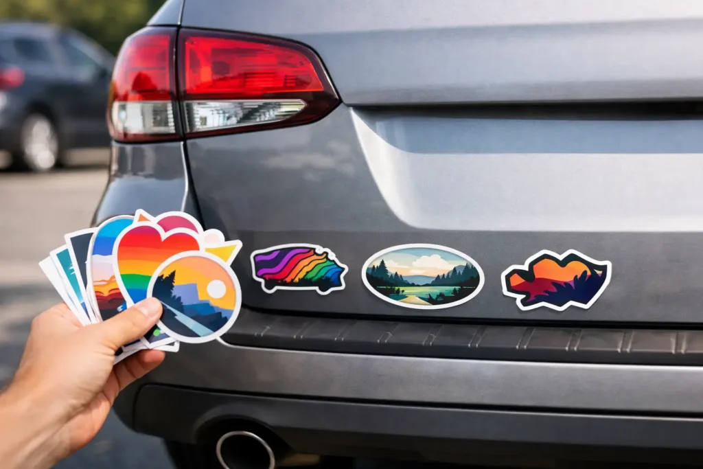
But safe does not have to mean boring. A die cut bumper sticker shaped around a simple logo, badge or icon can stand out in a car park. Just avoid complicated outlines, skinny points and tiny cut-out areas. Those details are harder to spot and can be less practical over time.
Think about where the sticker will go, too. A long horizontal design works well across a rear bumper or back window. A compact badge shape may be better for a side panel, tool box or trailer. Measure the available space before finalising the artwork, particularly for fleet vehicles where consistent placement matters.
Make the call to action realistic
A bumper sticker is excellent for awareness. It is less reliable for asking people to complete a complicated task while they are driving.
A short website, memorable business name or simple social handle can work if it is large enough to read. A QR code can be useful on a parked vehicle, trailer or display setup, but it should not be the main way someone discovers your brand from the road. People should never need to scan something from behind the wheel.
Phone numbers are another judgement call. If your number is short, well known or central to your business, include it. If adding it means shrinking the logo and headline, leave it out. A clear name people can search later is often the smarter move.
Build artwork that prints cleanly
Good design can still come undone with a poor file. For sharp bumper sticker printing, use high-resolution artwork and keep logos, text and graphics crisp. Vector files are ideal for logos and type because they can scale cleanly. If you are supplying a raster image, make sure it is high resolution at the final print size, not a small image pulled from social media.
Set colours in CMYK where possible. Screen colours use RGB light and can appear brighter than printed ink, so expect some variation between what you see on a monitor and the final sticker. A proof is your chance to catch a colour that feels off, a typo, or copy that needs to be bigger. Use it properly. Proofing is not a formality – it is where good artwork becomes print-ready artwork.
If you are unsure about bleed, file setup or whether your logo will reproduce cleanly, ask before ordering. A responsive print team can spot issues that are easy to miss when you have been staring at the same design for hours.
Do not forget durability and placement
Bumper stickers cop sun, rain, road grime and regular washing. Choose material and finish suited to outdoor vehicle use, especially for work fleets and trailers that spend all day exposed to the elements. A sticker that looks brilliant on day one but fades or lifts early is false economy.
Before applying it, clean the area thoroughly and make sure it is dry. Avoid placing stickers over sharp curves, damaged paint or areas likely to collect grime. Check that your design does not cover number plates, lights, reflectors, cameras or anything that affects visibility. Vehicle rules can vary by state and territory, so use common sense and check local requirements for your particular placement.
For a polished fleet look, decide on one position and use it across every vehicle. Consistency makes the brand look established, even when you are starting with one van and a big plan.
Give people a reason to remember you
The strongest bumper stickers do not shout every detail. They make one confident point, use colour and type with purpose, and hold up long after the first drive. That is the sweet spot between good-looking artwork and proper on-road advertising.
Whether you are branding a tradie ute, rallying support for a local club or giving your event some extra legs, keep it bold and keep it readable. Sticker Ninja can help turn a solid idea into an Australian-made bumper sticker that looks the goods wherever it ends up.