
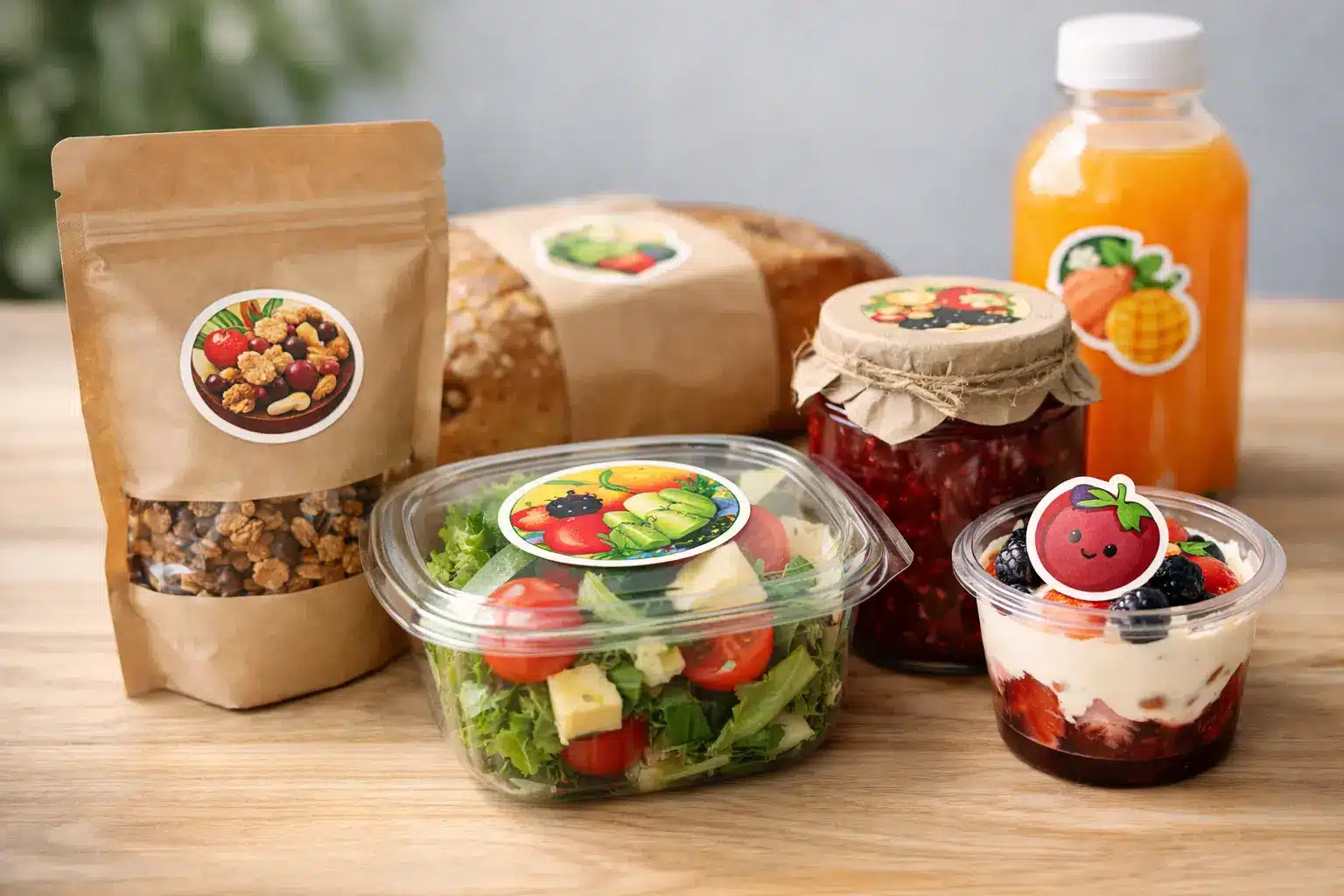
A great product can lose the sale in three seconds if the label looks flimsy, crowded or hard to read. Food packaging stickers are often the first physical touchpoint between your brand and a hungry customer, whether they are picking up cold brew at a market, comparing sauces on a shelf, or opening a delivery at home.
They need to work harder than a standard promo sticker. They have to look seriously good, stick properly, survive handling and help customers understand what they are buying without turning your packaging into a wall of tiny text. Get it right and your product looks established from day one. Get it wrong and even brilliant food can feel like a rough test batch.
What food packaging stickers need to do
A food sticker is part branding, part practical information and part sales pitch. The best designs create a clear hierarchy: the product name catches the eye first, the key flavour or benefit follows, then the finer detail is easy to find when someone picks it up.
For a small-batch chilli sauce, that may mean a bold logo, a flavour name such as Smoky Jalapeño, and a simple heat indicator. For cookies, granola or meal-prep containers, it may be a clean product name with a colour system that helps customers spot their favourite variety fast.
Your sticker also has a job after purchase. Packaging gets moved from shop shelf to car, fridge, pantry or lunch bag. It may deal with condensation, oily fingers and repeat handling. That is why the material and finish deserve just as much attention as your artwork.
Start with the pack, not the sticker shape
The container tells you what will work. It sounds obvious, but plenty of brands design a square label first and only later realise it will wrinkle around a curved jar or cover an important part of the packaging.
Flat pouches, boxes and trays are usually forgiving. Rectangular and square labels are efficient, provide plenty of room for copy and are easy to apply consistently. Round jars, tubs and bottles need a little more planning. A wide label can look excellent, but it needs to suit the curve and avoid lifting at the edges.
Die cut food packaging stickers are a strong choice when your brand has a distinctive shape, character or logo. A custom outline can make a simple kraft box feel more premium and more memorable. Kiss cut stickers suit branded sticker sheets, promotional inserts or orders where customers can peel off individual labels with ease.
Before ordering, measure the usable label area rather than the entire container. Allow space from seams, lids, curves and corners. If you are applying labels by hand before a market rush, leave yourself a bit of breathing room too. A label that is technically the perfect size but tricky to place will slow the whole packing bench down.
Match the material to real-world handling
Paper-style labels can give baked goods, coffee, pantry staples and handmade products a warm, crafted feel. They are a natural fit where the pack stays dry and you want texture or a more traditional look.
For chilled products, bottled drinks, freezer items or anything likely to meet moisture, a durable synthetic sticker material is usually the smarter call. The goal is simple: your branding should still look sharp when the customer pulls it from a sweaty esky or a busy café fridge.
Clear stickers can be brilliant on glass bottles, jars and transparent containers because they let the product do some of the selling. Use them where the food itself has strong colour or visual appeal, such as layered sweets, pickles, juices or spice blends. Keep the artwork high contrast, though. Fine pale text can disappear against a product that changes colour or texture.
A gloss finish brings colour and punch, which works well for energetic snack brands and retail-ready products. Matte can feel more refined and is often easier to read under bright lights. Neither is automatically better. It depends on the pack, the product and the personality you want customers to take home.
Design for the shelf, then for the close-up
Customers scan before they read. From a metre or two away, they should quickly understand the brand and product. Once they pick it up, they can take in ingredients, storage directions, serving ideas and the rest.
That means your main product name should not be an afterthought squeezed between decorative elements. Give it room. Choose type that is readable at the sticker’s actual printed size, not just on a large computer screen. If a customer has to squint to work out whether they are buying salted caramel or honeycomb, the design needs simplifying.
Colour is a practical tool here. A consistent base design with a different colour for each flavour makes a range easier to shop and easier to restock. Think of it as creating a visual shortcut. Once someone loves your lemon slice mix, they should be able to find the chocolate version without studying every label.
Photos can work, but they are not essential. A strong logo, confident type and one memorable graphic often have more impact than a busy image. Food packaging already has a lot competing for attention. A cleaner sticker usually wins.
Leave room for the information that matters
Branding gets the first glance, but clear product information earns trust. Food businesses need to make sure their labels carry the information required for the products and states where they are sold. Requirements can vary depending on what you make, how it is sold and whether it is packaged on site, so it is worth checking current Australian food labelling rules before you send artwork to print.
Common details may include ingredients, allergen declarations, nutrition information, date marking, storage instructions, country-of-origin information, net weight, batch details and business contact information. The exact requirements are not something to guess at, especially for products containing common allergens or products distributed beyond a local market.
The practical design lesson is to create room for this information from the start. Do not build your entire brand label around the front panel and hope the legal details fit later. A front sticker plus a back sticker is often the cleanest solution for jars, bottles and tubs. For pouches, a front-and-back layout can keep the hero design strong while making the fine print far easier to read.
If your packaging changes frequently, consider a consistent main label and a smaller variable label for flavour, batch, date or limited-run details. It can reduce waste and make short seasonal runs less painful to manage.
Make the unboxing worth remembering
Food packaging stickers do not stop at the container. A branded seal on a takeaway box, a thank-you sticker on a delivery bag or a small sticker included with an online order can make a modest package feel far more intentional.
That does not mean putting stickers everywhere for the sake of it. One well-placed seal can look premium. Five competing stickers can look messy and add unnecessary packing time. Choose the moment that matters most: tamper-style presentation, a branded takeaway experience, or a little extra personality for repeat customers.
For events and markets, stickers can also make last-minute product changes easier. If you have plain boxes or bags ready to go, a sharp label lets you switch flavours, update a special release or add event-only branding without ordering entirely new packaging.
Get the artwork right before production
The fastest way to delay a label order is unclear artwork. Use high-resolution files, check spelling carefully and make sure all text is readable at final size. Colours can appear different across screens, so avoid choosing a critical shade based only on what you see on a mobile or laptop.
Proofing is where small problems get caught before they become 500 expensive problems. Check product names, ingredients, weights, contact details and every date field. Then check them again with someone who did not build the artwork. Fresh eyes are good at spotting a missing allergen statement or a flavour name that has accidentally become a typo.
If you are new to custom print, do not try to bluff your way through material choices and sizing. Ask questions early. A specialist sticker printer can help you choose a format that suits the container, handling conditions and look you are chasing. Sticker Ninja is built around that kind of no-fuss support, with Australian-made custom stickers for brands that need to look the part without waiting around.
Your food deserves packaging that creates confidence before the first bite. Keep the message clear, choose materials for the way the product will actually be handled, and make every sticker feel like it belongs on the shelf.