
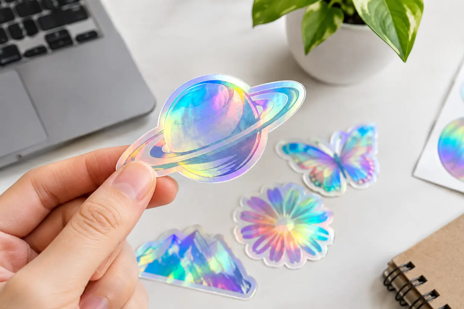
A holographic sticker can make a simple logo look like it belongs on the front of a limited-edition product drop. But to design holographic stickers that actually look sharp, you need to work with the rainbow finish instead of hoping it behaves like plain white vinyl. Light, colour, line weight and empty space all matter more here.
That is the good news, too. Get those choices right and you have a sticker people tilt towards the light, stick on their water bottle, laptop, tool box or ute, and show their mates. That is serious mileage from a small piece of print.
Start with what the holographic finish does
Holographic material catches light and reflects it in shifting colours. Under one angle, it may look silver. Move it a little and it throws rainbow flashes across the design. It is a big visual payoff, particularly for brands, events and creatives that want something beyond the usual matte or gloss sticker.
It also means the material becomes part of your artwork. White areas will not necessarily appear white when printed on holographic stock. Pale colours can lose their punch. Fine details may compete with reflections. A design that looks brilliant on a white screen can need a rethink before it hits holographic material.
Treat the foil effect as a feature, not a background you need to cover up. Let it show through in chosen areas and your sticker will feel intentional rather than busy.
Design holographic stickers with bold contrast
The safest route is high contrast. Strong black artwork is a classic choice because it stays crisp against the shifting foil. Deep navy, dark purple, saturated blue and rich magenta can also work well, depending on the design and print setup. Thick white elements may be an option where white ink is available, but it is worth confirming the production approach before building your whole concept around it.
For a logo sticker, start with a solid, recognisable version of your mark. If your brand identity relies on a very pale yellow, soft grey or thin pastel lettering, consider using a darker logo variation for holographic stickers. You are not changing your brand. You are making it legible on a material with plenty of personality.
Think about viewing distance as well. A holographic sticker seen across a market stall, on a café counter or on the back window of a vehicle needs a clear silhouette. If the main message only works when someone is ten centimetres away, simplify it.
Keep type thick and easy to read
Tiny text is rarely the hero on any sticker, and holographic stock gives it even less room to perform. Use clean, bold fonts and allow enough spacing between letters. Fine serif details, hairline scripts and condensed all-caps type can look great on screen but may lose clarity once light starts bouncing around the surface.
If you need to include a website, event date or social handle, make it useful rather than ornamental. Ask yourself whether someone can read it in a quick glance. If not, increase the size, reduce the copy or move that detail to packaging, a flyer or a sticker sheet where it can sit beside a larger hero design.
Use the rainbow strategically
The best holographic designs leave room for the material to do its thing. A die cut logo with open foil around the lettering can look more premium than a fully printed rectangle. A simple mascot, icon or line-art illustration can gain movement as the holographic background changes in the light.
This is especially effective for music events, car clubs, skate and streetwear labels, gaming communities, beauty brands, product launches and party favours. A rainbow finish instantly adds a collectable feel, even when the artwork itself is simple.
Choose a shape that supports the artwork
Holographic stickers do not need to be complicated to stand out. In fact, a clean die cut shape often gives the material more impact than a crowded design with too many edges.
Follow the outside contour of a mascot, product illustration or chunky wordmark when the silhouette is strong. Go with a circle, oval, square or rounded rectangle when your logo needs breathing room or you are making stickers for fast handouts. Rounded corners tend to wear well and are less likely to lift than sharp points, especially on frequently handled items.
Avoid extremely narrow spikes, tiny cut-outs and fragile details around the edge. They can make peeling trickier and may not hold up as well after application. A good sticker should look mint when it arrives and still look good after a few knocks in the real world.
For multi-design runs, sticker sheets are worth considering. They let you combine a hero holographic logo with smaller icons, taglines or product-themed illustrations. Customers and event guests love a sheet because they can choose where each piece goes. Your brand ends up in more places without needing a huge sticker every time.
Build your artwork for print, not just the screen
Screens are bright. Print is physical. That sounds obvious, but it is the reason a design can look perfect in a design app and underwhelming when printed.
Create artwork at the final print size where possible, using high-resolution images and vector files for logos and line work. Vector artwork keeps curves, type and edges clean when scaled. For supplied images, aim for sharp source files rather than screenshots pulled from social media. A blurry image does not turn crisp because it is printed on shiny material.
Keep important text and elements away from the cut line. Stickers need a little safety area so trimming does not crowd your message. If the design uses a background colour or printed area that runs to the edge, include bleed so there is no accidental sliver of unprinted material around the final cut.
Use CMYK-aware artwork for the most realistic print expectations. Bright RGB colours from a screen can shift in print, and holographic material adds another visual variable. If colour matching is non-negotiable for a national campaign or an established brand system, talk through it before ordering. For most promo stickers, a strong visual result matters more than chasing a screen-perfect shade.
Know when holographic is the wrong call
Holographic stickers are attention-grabbers, not a default answer for every job. If you need a clean corporate label with lots of small compliance text, a white or clear sticker may be more practical. If the sticker will carry barcodes, ingredients, fine instructions or important contact details, readability should win.
The same goes for designs built around subtle photography. A holographic finish can be fun, but it may distract from skin tones, product colours or delicate gradients. Choose it when you want energy, reflectivity and a bit of surprise. Choose another material when your design needs to stay quiet.
That trade-off is what makes the finished piece feel considered. Not every sticker has to shout. The right one should do the job it is meant to do.
Get the proof right before production
A proof is your chance to catch the small stuff that becomes very obvious once hundreds of stickers are printed. Check spelling, phone numbers, dates, social handles, logo versions, cut shape and the size of fine details. Look at it on a mobile as well as a larger screen. If it is hard to read on your phone, it will not improve once it is reduced to sticker size.
Be clear about where the stickers will be used. Packaging labels, giveaway merch, retail displays, event bags and car club handouts all call for slightly different priorities. A quick explanation gives the print team context, and that can save you from ordering a design that is technically fine but not right for the job.
For businesses on a deadline, do not leave artwork approval until the last minute. Fast turnaround is brilliant, but it works best when the artwork is ready and decisions are made early. Sticker Ninja is built for no-fuss custom sticker orders, with responsive proofing support when you need a second set of eyes on the details.
A great holographic sticker does not need fifty colours or a complicated illustration. Give it a bold idea, readable artwork and enough open space for the foil to flash. Then stick it somewhere worth being seen.