
Uncategorized
Packaging Labels That Actually Do the Job
30
May
May
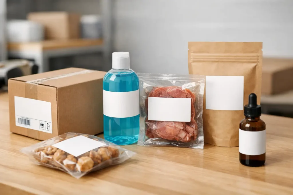
A great product can still look second-rate if the packaging labels are off. Crooked application, fuzzy print, the wrong stock, poor adhesion – customers notice all of it. Whether you are shipping candles, jars, coffee, skincare, meal prep, event merch or retail boxes, your label is doing a lot of heavy lifting before anyone even uses what is inside.
That is why packaging labels are not just a finishing touch. They are part branding, part practical information, part first impression. Get them right and your product looks polished, trustworthy and ready to sell. Get them wrong and even a solid product can feel rushed.
Why packaging labels matter more than most brands think
Most businesses start with the obvious question: what size label do I need? Fair enough. But the better question is what job the label needs to do.
For some brands, packaging labels need to make a plain box feel premium. For others, they need to survive cold storage, moisture, rough handling or long freight runs. A real estate agency might need labels for folders and marketing packs that look clean and consistent. A food business might need labels that stay put in the fridge and leave enough room for ingredient and date information. An event organiser might need branded labels that turn basic packaging into something worth handing out.
The point is simple – not every label is solving the same problem. The right choice depends on where it is going, how long it needs to last and what your customer needs to see at a glance.
What good packaging labels actually need to do
At the bare minimum, a label needs to stick properly, print clearly and fit the packaging without looking like an afterthought. That sounds basic, but it is where plenty of orders go wrong.
If the adhesive is too weak, labels can lift at the corners or peel during transport. If the material is wrong, the surface can scuff, wrinkle or bubble. If the artwork is cramped, important details become hard to read. And if the size is off, even a beautiful design can look awkward on the finished product.
Strong packaging labels usually balance four things: appearance, readability, durability and speed of application. The balance matters. A glossy label might look unreal on the shelf, but if it smudges in a busy packing area, it is the wrong pick. A super durable stock might survive anything, but if it blows the budget for a short-run promo pack, there may be a better option.
Choosing the right label stock for the job
This is where it pays to be practical. Not every business needs the toughest material on the market, but every business does need a label stock that suits real-world use.
Paper labels can work well for dry goods, short-term promotions and packaging that stays indoors. They are often a cost-effective option when you want a clean branded finish without going over the top. But paper is not always ideal for products exposed to moisture, oil, friction or temperature changes.
Vinyl or synthetic options are the better move when durability matters. If your packaging is going into eskies, fridges, bathrooms, delivery vans or busy retail handling, a tougher material earns its keep quickly. The same goes for products applied to curved containers or squeeze bottles, where flexibility and adhesion matter more than people expect.
There is also the finish to think about. Matte can look refined and make text easier to read. Gloss can add punch and make colours pop. Clear labels can look sharp on glass or smooth containers, but only if the artwork has been set up properly and the product beneath does not make the text disappear.
Design tips that make packaging labels look better fast
A lot of label design problems come from trying to fit too much into a small space. If every bit of text is shouting for attention, nothing stands out.
Start with hierarchy. Your brand name, product name and any critical product info should be the easiest things to spot. After that, supporting details can sit comfortably without turning the label into a wall of tiny text. White space helps more than people think. It gives the design room to breathe and makes the whole thing feel more premium.
It is also worth designing with the actual container or box in mind. A label viewed flat on a screen can behave very differently once it wraps around a jar or sits across a cardboard seam. Curves, folds and edges all affect how the final piece looks.
If your product range includes multiple flavours, scents or variations, keep the layout consistent and swap colours or small graphic elements instead of reinventing the wheel each time. That saves time, keeps the range looking tidy and makes reorders much easier.
Print clarity is not optional
Tiny fonts, low-resolution logos and weak contrast are a fast way to make packaging look cheap. Clean artwork matters. So does knowing how the label will be printed and viewed.
If customers need to read ingredients, care instructions, dates or directions, clarity wins over cleverness every time. Fancy scripts have their place, but not where legibility matters. A good label can still have personality without making people squint.
Where businesses usually get caught out
Deadlines are a big one. Plenty of businesses leave packaging labels until the last minute, then realise too late that artwork needs fixing, measurements are off or the chosen stock does not suit the container. That creates stress that is completely avoidable.
Another common issue is ordering based on price alone. Cheap labels can look fine in a sample image, but if they arrive with weak adhesive, dull print or inconsistent cutting, they cost more in the long run. Reapplying labels, replacing stock or sending out shabby packaging is not a bargain.
There is also the temptation to overcomplicate things. Foils, specialty finishes and unusual shapes can look brilliant when they are used well. But if they slow application, reduce readability or do not suit the product, they can become an expensive distraction. Sometimes a sharp, well-printed standard label wins because it just works.
Packaging labels for shipping, retail and events
Not all packaging labels are customer-facing in the same way, but they still matter.
For shipping, labels often need to combine branding with practical handling information. You want them tough enough to survive transit and clear enough that nothing gets missed in the process. For retail packaging, shelf appeal becomes more important. Customers are making quick decisions, so your label needs to communicate quality fast.
For events, packaging labels can elevate simple giveaway items, boxed kits, satchels or thank-you packs without blowing the budget. A plain pack with a quality custom label can look considered and on-brand in a way generic packaging never will.
That flexibility is what makes labels such a smart print product. You can use them to sharpen presentation, improve consistency and add branded detail without needing to overhaul your entire packaging setup.
When custom shapes make sense
Custom shapes can be a weapon when the product calls for it. They help reinforce branding and can make a package feel more tailored. But shape should support the application, not make it harder.
If your team is applying labels by hand at speed, a simple shape is often the smarter choice. If the product is premium, gift-focused or highly visual, a custom die cut can absolutely add value. It depends on your volume, your timeline and how the labels are being used day to day.
How to order packaging labels without the usual headaches
The smoothest orders usually start with three things sorted early: packaging dimensions, artwork and use case. Know what the label is being applied to, roughly what size works visually, and what conditions it needs to survive. That cuts out a lot of back-and-forth.
If you are unsure, say so upfront. A decent print partner should help you avoid bad choices, not just process the file and hope for the best. Proofing matters. So does responsive support. When you are trying to launch a product, restock packaging or get event materials out the door, fast answers are not a bonus. They are part of the service.
This is exactly why specialist print suppliers tend to outperform generic print shops on label work. They have seen the common mistakes before, they know what materials suit different jobs, and they are more likely to catch issues before they become expensive. That kind of support is worth plenty when the deadline is breathing down your neck.
Sticker Ninja works with businesses that need packaging labels to look sharp, stick properly and arrive fast, without all the usual runaround. That no-fuss approach matters when you have products to pack and customers waiting.
The best label is not the fanciest one. It is the one that makes your product look legit, holds up in the real world and keeps the whole job moving without drama. If your packaging needs to work harder, start there.