
Uncategorized
Sticker Proofing Before Printing Done Right
29
Jul
Jul
A typo on a business sticker is not a tiny mistake once 5,000 of them are on their way to site, packed into event bags or stuck to product boxes. Sticker proofing before printing is the moment to catch the stuff that costs money, delays launches and makes a great design look ordinary in the real world.
A proof is your final chance to check what is being produced, not just what looked good on your screen at 11 pm. Give it the attention it deserves and your stickers will show up sharp, readable and ready to work hard for your brand.
What sticker proofing before printing actually checks
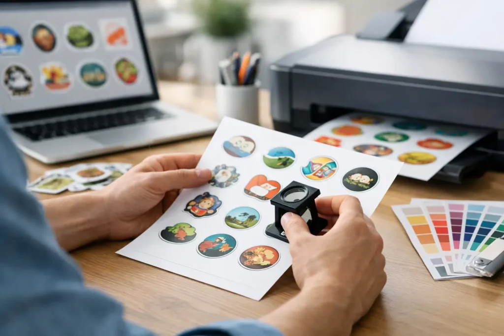
A sticker proof is a digital representation of your artwork prepared for production. It shows key details such as the final trim shape, cut line, artwork placement and, where relevant, bleed and safe areas. For die cut stickers, this matters because the white border or custom outline can change the whole feel of the finished piece. For labels, it can be the difference between text sitting neatly on a jar and disappearing around a curve.
It is not simply an approval form. It is a practical quality check between your original file and the finished stickers. A good proof helps confirm that the printer has interpreted the artwork correctly and gives you a clean opportunity to request changes before production begins.
Digital proofs are brilliant for checking layout, spelling, dimensions and cut paths. They cannot perfectly reproduce every screen’s colour display or show exactly how a metallic, holographic, clear or textured material will react under different lighting. If an exact brand colour is non-negotiable, say so early and ask about the best production approach for the job.
Check the details people miss
The obvious checks are still the ones that catch the biggest headaches. Read every word, including web addresses, phone numbers, social handles, dates and disclaimers. Do not rely on a quick glance. Read it aloud, or get someone who did not create the artwork to check it. Fresh eyes spot the missing digit in a mobile number far faster than the person who has stared at the design for three days.
Then check the size against where the sticker will actually live. A 50 mm round sticker may look generous on screen but feel small on a ute window, takeaway cup or shipping carton. Conversely, a large label can overwhelm a candle jar or product pouch. If you are reordering, compare the dimensions with the previous job rather than assuming the file is set up the same way.
Look closely at the cut line too. With die cut stickers, the shape should follow your design in a way that feels intentional. Fine points, narrow gaps and ultra-tight curves may need a little breathing room to cut cleanly and remain durable. Kiss cut stickers and sticker sheets need extra attention around individual sticker spacing, so the finished sheet is easy to peel and use.
Also check what happens near the edge. Background colours, patterns and photos should extend beyond the trim line through the bleed area. Important text, logos and faces should sit safely inside the edge. A proof may show this clearly, but it is still your job to make sure the final placement feels right.
Your five-minute proof check
Before approving, slow down and confirm these five things:
- The artwork is the correct version, with no old logo, outdated offer or superseded contact details.
- Every word, number and QR code is accurate and readable at the sticker’s final size.
- The dimensions, orientation and quantity match what you intended to order.
- The shape, border and cut line look right for the chosen product.
- Important design elements sit clear of the trim edge, with backgrounds extending into bleed.
That last point is where a lot of otherwise polished artwork comes undone. A logo placed right on the edge can look cramped even when nothing is technically cut off. Give the design room and it will look more premium in the hand.
Colour is where expectations need to be realistic
Your laptop, office monitor and mobile screen can all show the same blue differently. Screen colour is made with light, while print uses inks on a physical material. That means a digital proof is an essential guide, but not a promise that every shade will appear identical to what you see on screen.
For most sticker jobs, the goal is strong, consistent, great-looking colour that supports your branding. Use high-resolution artwork, avoid relying on very subtle tonal differences and make sure your logo files are current. If your business has strict brand requirements, provide the relevant colour references with the artwork before the proof is created.
Material changes the result as well. Clear stickers allow the surface beneath to influence the look. Holographic stickers shift with the light. Matte and gloss finishes can make colours feel different, while bumper sticker material needs to prioritise outdoor toughness. There is no single “best” option – it depends on where the stickers will be used and what you want them to do.
Do not approve just to save time
Tight deadline? We get it. Real estate campaigns, trade shows, weekend markets and product launches rarely leave much room to move. But approving a proof without checking it is a false economy. Once printing starts, changes may no longer be possible, and a rushed approval can create a much bigger delay than taking ten minutes to review the file properly.
If something does not look right, reply with clear, specific feedback. “Make it better” is hard to action. “Please move the website 3 mm up”, “change the border to black” or “use the updated logo attached” gives the production team exactly what they need. Marking up a screenshot can help when you are discussing a particular part of the artwork.
Be equally clear when the proof is approved. Check that you are approving the final version, not an earlier email attachment. Version control sounds boring until a previous logo or old event date accidentally makes it to print.
Who should approve the sticker proof?
For a sole trader, that might be you. For a larger business, it is worth nominating one person who has authority over the brand and the campaign details. Multiple people sending conflicting changes can turn a simple proof into a back-and-forth marathon.
That does not mean you should approve in isolation. A second check from someone in sales, marketing or operations is useful when the stickers include pricing, promotional terms, compliance information or location-specific details. The person ordering the stickers may know the artwork, but the person using them on the ground may spot a practical issue, such as text being too small for a shopfront window.
Make future reorders easier
The best proofing process gets faster over time. Keep a folder with your approved artwork, final proof, product size and notes on material or finish. Name files clearly, using a date or version number. Files called “final-final-NEW2” are funny until the wrong one gets printed.
If a sticker performs well, record why. Maybe the 75 mm die cut sticker was the sweet spot for hard hats, or the matte finish made QR codes easier to scan under shop lighting. Those details help you reorder confidently and keep your branding consistent across flyers, labels, badges and signage.
At Sticker Ninja, responsive proofing is there to remove the guesswork, not add another hoop to jump through. Treat the proof as your last proper look at the job, ask questions when something feels off and approve only when you would be happy to see that sticker on every product, parcel or window it touches.
A few focused minutes before print can protect weeks of planning. Your stickers are often the first thing people notice – make sure they say exactly what you meant them to say.