
Uncategorized
How to Design Die Cut Stickers That Get Seen
31
Jul
Jul
A die cut sticker gets about two seconds to make an impression. On a coffee cup, tool box, ute window, product parcel or event giveaway, it needs to be clear before anyone is close enough to read the fine print. That is why learning how to design die cut stickers is less about cramming in every brand element and more about making one strong visual idea impossible to miss.
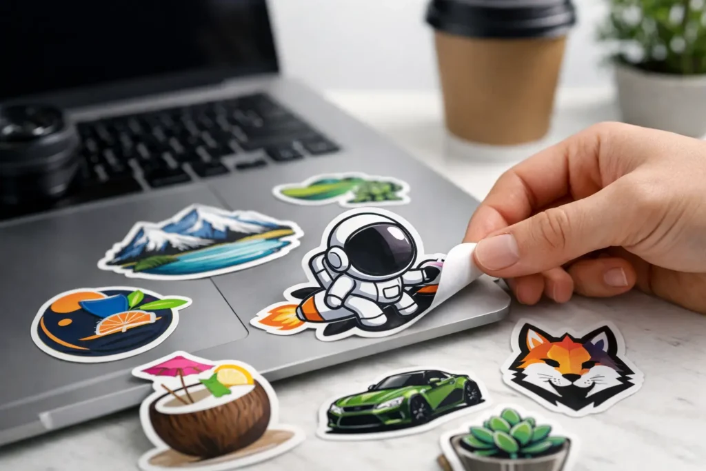
Die cut stickers are cut to the shape of your artwork rather than a standard square, rectangle or circle. That extra freedom is exactly what makes them memorable. It can also create trouble if the artwork is too detailed, the outline is too tight or the design only works at full screen size.
Start with the job your sticker needs to do
Before opening a design program, decide where the sticker will live and what it needs to achieve. A sticker handed out at a festival can be playful and visual. A label for product packaging may need a product name, key information and a logo. A tradie’s sticker for a work vehicle needs to remain readable from a few metres away.
This decision shapes everything else: size, material, colours, level of detail and finish. A small 50 mm sticker is not a mini billboard. Give it one key message, a recognisable mark or a bold illustration. If you need lots of copy, a larger format or a sticker sheet may be the smarter call.
Think about the surface, too. A sticker going on indoor packaging has different demands from one facing sun, rain, dust and car washes. Clear stickers suit glass and a clean, minimal look, while holographic stickers are built to grab attention under changing light. Standard white vinyl is the reliable all-rounder when colour accuracy and contrast matter most.
Build the shape around the artwork
The best die cut shape follows the strongest part of the design. It should feel intentional, not like the cutter has simply traced every bump, letter and stray detail in the file.
For a logo with a simple icon, a close contour can look sharp. For an illustration with fine lines, loose details or text, leave a consistent border around the artwork. This border, often called a white edge or sticker border, protects the design visually and gives the cut line room to breathe.
A good rule is to avoid narrow points, hairline gaps and tiny islands in the outline. They can be difficult to peel, more likely to lift at the edges and less forgiving in real-world use. Smooth curves and broader corners generally produce a cleaner, tougher sticker.
If your logo is a wordmark, do not assume every letter needs to be individually cut. Individual lettering may look clever on screen but can be awkward to handle, especially in smaller sizes. Putting the wordmark inside a simple badge shape or giving it a generous outer border often delivers a better result.
Keep the cut line simple
Your cut line should sit outside the printed artwork, following the overall silhouette. It is not a second illustration. Avoid making it weave through internal gaps unless those gaps are essential to the design and large enough to survive cutting and handling.
When in doubt, test the shape at actual size. Print it on your office printer, cut it out roughly and stick it on the intended surface. You will quickly see whether the pointy corners feel flimsy, the text is too small or the shape disappears against the background.
Make the design readable at sticker size
Big, bold shapes win. That does not mean every sticker needs shouty colours and oversized type, but it does mean hierarchy matters. Someone should understand the sticker’s main idea at a glance.
Start with the hero element. It could be a logo, mascot, product name, event date or short line of copy. Make that element dominant, then support it with smaller details. If every element is trying to be the hero, nothing gets noticed.
Choose typefaces that remain legible when printed small. Fine serif fonts, thin scripts and ultra-light weights can look great in a brand deck yet lose clarity on a 60 mm sticker. Use enough contrast between the text and background, and do not place important copy too close to the edge.
Colour needs the same discipline. A bright palette can be brilliant for a skate brand, club or event, but neighbouring colours still need enough contrast to separate at a glance. Dark text on a pale background and pale text on a dark background are safe, high-impact choices. If your branding relies on subtle tonal shifts, increase the size of the sticker so those details have room to work.
Also remember that screens emit light and printed stickers do not. Colours can appear brighter on a monitor than in print. Build artwork with solid contrast rather than relying on barely-there shadows or pale gradients to define important information.
Set up print-ready artwork properly
Great design can still fall short if the file setup is wrong. Start at the final print size, or larger in the same proportion. For crisp printed results, artwork should generally be supplied at 300 DPI at its final size. A small image pulled from social media may look acceptable on a mobile but become blurry when enlarged for print.
Vector files are ideal for logos, text and clean illustrations because they can scale without losing sharpness. Common vector formats include AI, EPS, SVG and print-ready PDF. High-resolution PNG files can also work well for artwork with transparency, provided they are created at the correct size and resolution.
Set your colours to CMYK for print where possible. RGB is made for screens and can shift when converted. Brand colours that are especially critical deserve a proof check, particularly if you are matching other printed material such as flyers, signage or packaging.
Leave bleed around designs where the print runs to the edge. Bleed is extra background artwork beyond the intended cut line, allowing for tiny movement during trimming without leaving an unwanted white sliver. Keep text, logos and key details inside a safe area away from the edge. The exact allowance can depend on the artwork and sticker shape, so following the supplied template or proof guidance is the easy win.
Do not flatten your design choices too early
Keep an editable version of your artwork with layers, fonts and original graphics before exporting the final file. It makes future reorders, size changes and campaign updates far less painful. For the file you send to print, outline fonts or supply them correctly so type does not unexpectedly change.
If you are unsure whether your file is ready, ask for help before production. A quick artwork check is far cheaper than receiving stickers with a pixelated logo, a missing font or text that sits too close to the cut edge.
Choose a finish that supports the design
A die cut sticker is not just an image. It is a physical bit of your brand that people touch, peel, keep and stick somewhere visible. The material and finish should suit the setting.
White vinyl gives colours a solid base and works for most logo stickers, packaging, merch and outdoor use. Clear stickers can make a design feel more refined, but remember that pale artwork may lose impact on a dark surface. Holographic material brings movement and shine, which is ideal when the goal is attention, but it can compete with very detailed artwork. Keep the design graphic and confident so the finish has room to do its thing.
Matte and gloss choices come down to the look you want and where the sticker will be seen. Gloss tends to make colours pop, while matte offers a more understated finish with less glare. Neither is automatically better. A premium skincare label, a car club decal and a kids’ event giveaway may all need different answers.
Check the proof like it is going on your own gear
A proof is the moment to slow down. Check spelling, phone numbers, web addresses, dates, colour choices, dimensions and the cut line. Zoom in to inspect details, then zoom out or view it at actual size to judge the overall impact.
Ask one practical question: would a person who does not know the brand understand this sticker immediately? If the answer is no, simplify it. Remove a line of copy, enlarge the logo, strengthen the contrast or choose a cleaner shape. More information is not always more useful.
For businesses ordering a large run, it can be worth getting a small batch first if the design is untested or the colour match is particularly sensitive. For a proven logo sticker, reordering is much simpler once the artwork and size are locked in.
Design for the moment after it leaves your hands
The best stickers do not feel like advertising people are being forced to carry. They feel like something worth keeping. A sharp logo, a clever mascot, an inside joke for your community or a genuinely great-looking illustration can turn a low-cost giveaway into repeated brand exposure on laptops, water bottles, hard hats and car windows.
Keep the message clear, give the cut line some breathing room and send artwork that is built for print, not just for a screen. If you want a no-fuss second set of eyes before pressing go, Sticker Ninja can help turn a good concept into a sticker people actually want to stick somewhere.