
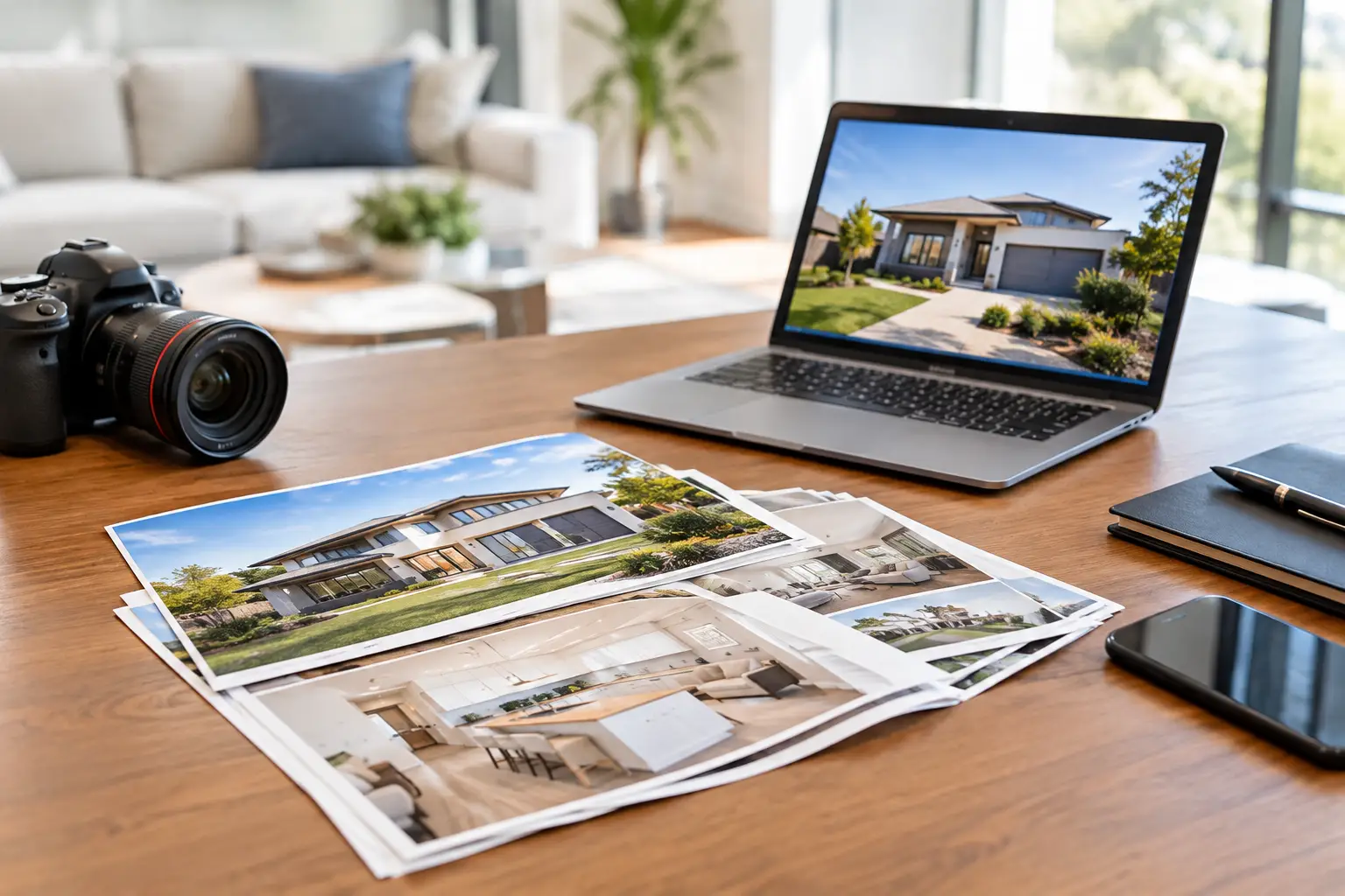
A property can have polished photos, a great campaign and a solid price guide, then still lose attention at the front gate. Why? Because buyers, neighbours and passers-by often meet the print first. This property marketing materials guide is for agents who want every sign, flyer and sticker to look sharp, work hard and help generate real enquiries.
Property marketing is fast-moving. Listings can go live on Monday, inspections are on Saturday, and a vendor wants proof that their home is being pushed properly. The answer is not to print everything imaginable. It is to choose a tight set of materials that put the property, the agent and the next action front and centre.
Start with the buyer journey, not the print catalogue
The best property campaigns make sense from a buyer’s point of view. Someone notices a board while driving past, sees a flyer at an open home, saves the details, then comes back with a question or books another inspection. Each printed piece should help that next step happen.
Street-facing material needs instant impact. Open-home material needs clear facts. Takeaway pieces need to be useful enough that they do not end up in the rubbish before the buyer gets home. Branding materials need to build recognition without taking over the property campaign.
That means choosing print formats based on where they will be seen, how long they need to last and what you want people to do next. A premium waterfront listing and a compact investment unit do not necessarily need the same campaign kit. Spend where it is visible and useful.
The property marketing materials that earn their keep
Signage that makes the listing impossible to miss
A property board is often the hardest-working item in the campaign. It must be readable at a glance, look professional in changing weather and make it easy to identify the agency and listing status.
Keep the design clean. Use a strong hero image where appropriate, a clear agency logo, the property address and a short, useful call to action. If the board is viewed from a moving car, tiny copy is dead weight. Buyers should be able to understand the basics in seconds.
Directional signs matter too, particularly for homes tucked into estates, unit complexes or streets with awkward access. They should match the campaign look, point clearly and be placed only where permitted. A beautiful sign that sends people down the wrong street is not helping anyone.
For window displays, corflute signs and larger-format pieces, consider viewing distance before finalising artwork. A design that looks brilliant on a desktop screen can become cluttered in the real world.
Flyers that give buyers a reason to follow up
Property flyers are still one of the most practical handouts at inspections, auctions and local letterbox drops. They work because buyers can take the key details with them, share them with a partner or compare the listing later that night.
A good flyer leads with the property, not a block of agency messaging. Include professional images, the address, key features, inspection information, contact details and a clear next step. A QR code can be useful if it takes people directly to the listing or enquiry page, but it should support the flyer rather than replace the vital information.
Paper stock and finish depend on the campaign. A standard, well-designed flyer is ideal for high-volume distribution. A heavier stock can suit prestige campaigns or private inspections where the presentation needs to feel more considered. The trade-off is simple: premium finishes create a stronger impression, but they are not always necessary for broad drops.
Stickers and labels that keep your brand in view
Stickers are a simple way to turn ordinary campaign items into branded touchpoints. Real estate stickers can be used on property brochures, folders, sold packs, signage accessories, gift boxes and office materials. They are small, but repeated use builds familiarity.
For practical jobs, choose the stock to suit the surface and conditions. Durable vinyl stickers are a smart option for vehicle branding, outdoor equipment and items that will cop rain, sun and regular handling. Paper labels can work well for temporary information, presentation folders or event items kept indoors.
Clear stickers are a tidy choice for glass doors and windows where you want the message to sit neatly on the surface. Die cut stickers help create a premium, custom shape around a logo or campaign graphic. Holographic options can grab attention, though they are usually better suited to agency giveaways or a bold brand activation than a serious property brochure.
Sticker Ninja produces Australian-made custom stickers and print products for businesses that need sharp results without the usual runaround. If you are ordering for the first time, a proofing process is worth its weight in gold. It catches sizing, spelling and placement issues before they reach a full print run.
Open-home materials that make the room feel organised
An open home is not just a walkthrough. It is a live brand experience, and the print on display helps buyers feel that the campaign is being run properly.
Start with a clear sign-in point and a polished property flyer. Add small directional signs where needed, especially in larger homes or multi-level properties. If you provide shoe covers, refreshments or take-home packs, branded labels and stickers can make those details feel intentional rather than cobbled together five minutes before the doors open.
Button badges can also work at auctions, community events or team-led inspection days when buyers need to know who is hosting. Keep them simple: name, agency branding and role. They are not essential for every inspection, but they can be handy when several staff members are working a busy campaign.
Design rules that stop good print going bad
Most print mistakes happen before production. Low-resolution images, unclear artwork, mismatched colours and overcrowded layouts can make even a quality product look cheap.
Use high-resolution files from the beginning. Make sure logos are crisp, photographs are supplied at print-ready size and text is large enough for its viewing distance. If your brand has approved colours and fonts, use them consistently. Every listing does not need a fresh visual identity from scratch.
Also check the details people notice immediately: street numbers, inspection times, mobile numbers, web addresses and legal wording. One incorrect digit can cost an enquiry. Get a second set of eyes on the proof, especially when several listings are being prepared at once.
Do not cram every selling point into one layout. Three memorable highlights beat twelve lines of tiny copy. “Walk to the station”, “north-facing courtyard” and “renovated kitchen” will land faster than a dense paragraph trying to say everything.
Plan quantities around campaign reality
Ordering too little creates stress. Ordering far too much burns budget and leaves old material in the office cupboard. Start with likely foot traffic, expected inspection numbers and whether the listing will receive local letterbox distribution.
For a standard open home, order enough flyers for the expected turnout plus a sensible buffer for repeat inspections, vendor copies and follow-up appointments. For a letterbox campaign, map the streets properly before deciding quantity. A broad drop can be useful for building local momentum, but only when the property and audience justify it.
Think about timing early. Print should be ready before photography is published, boards are installed or the first inspection is announced. Rush jobs happen, but they should be the exception. Giving yourself a little production breathing room means you can review proofs properly instead of crossing fingers at the last minute.
Build a campaign kit your team can repeat
The easiest way to keep quality high is to create a repeatable campaign kit. This might include a property board template, flyer format, directional sign design, open-home sign-in sheet, branded labels and a sold sticker or card for settlement gifts. The look stays consistent while the property details change.
Consistency saves time, reduces artwork errors and makes your agency more recognisable in the local market. It also helps newer team members put campaigns together without reinventing the wheel every time.
There is no prize for using the most materials. The win is a property campaign that looks considered at every touchpoint, directs buyers clearly and keeps your agency memorable after the inspection. Choose print that suits the listing, proof it carefully and make sure every piece gives people a clear reason to take the next step.