
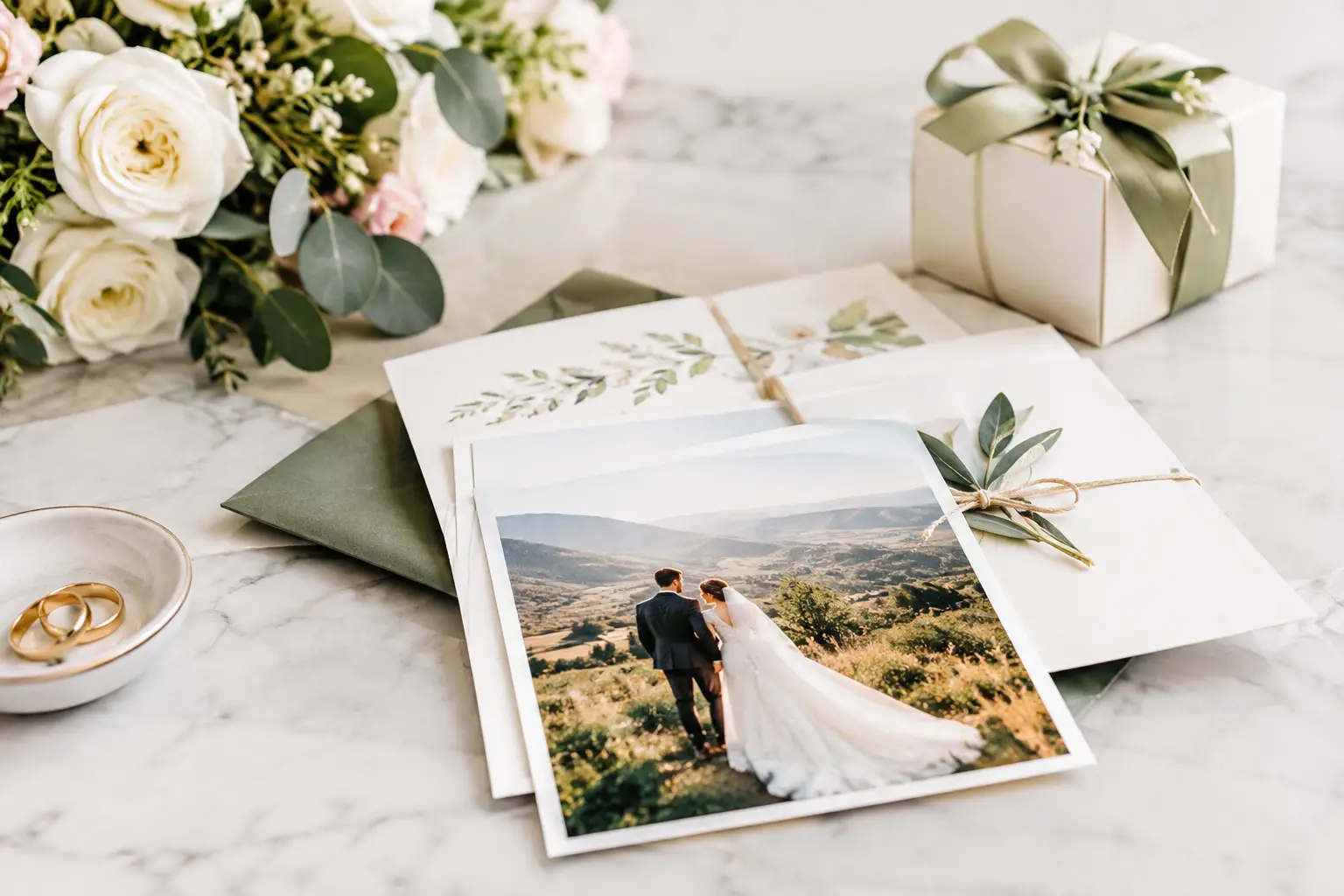
A wedding has a lot of moving parts. Your wedding print materials are the bits that make those moving parts feel intentional – from the first save-the-date in the letterbox to the sticker sealing a thank-you favour at the end of the night.
The best print does more than look pretty in photos. It tells guests where to be, sets the mood before they arrive, and gives the day a consistent visual thread. You do not need a mountain of matching paper products to pull that off. You just need the right pieces, designed clearly and printed properly.
Start with the moments guests actually notice
Couples can get carried away trying to brand every surface. That can be fun, but it can also chew through the budget fast. Start with the materials that have a job to do or will genuinely be handled by guests.
Invitations and save-the-dates are the obvious first impression. They establish the colour palette, type style and level of formality. A relaxed coastal wedding might suit sun-washed colours and a simple illustrated motif. A formal city reception might call for clean typography, rich dark tones or a restrained monogram. Whatever you choose, make it feel like you. Copying a trend that does not suit the venue or the couple rarely lands well.
On the day, signage takes over. Welcome signs, ceremony programs, seating charts, table numbers and menus make the experience easier to navigate. At the reception, small printed details do plenty of heavy lifting too: place cards prevent the awkward table hunt, bar signs answer the same drink questions all night, and a guest book sign makes it clear what you would like people to do.
Then there are the take-home pieces. Thank-you cards, favour labels and custom stickers give guests something tangible to keep. They are small, but they can make the whole event feel considered rather than thrown together.
Wedding print materials need a clear hierarchy
A gorgeous sign that nobody can read from three metres away is not doing its job. Design for the real setting, not just the screen on which you create it.
Put the most important information first. On an invitation, that means names, date, location and RSVP instructions. On a seating chart, guests need their names and table numbers before they need a decorative quote. On a menu, make food descriptions easy to scan and dietary labels impossible to miss.
Choose one or two typefaces, then use size and weight to create order. Script fonts can look brilliant for names or a short heading, but they are hard work in long blocks of text. Pair one with a clean, readable font for practical details. If a grandparent would need to squint at it, go bigger.
Colour needs the same common sense. Soft text on a pale background may look subtle on a laptop but disappear under venue lighting. High contrast is your mate here. A print proof is also worth its weight in gold, especially for dark artwork, pale pastels, fine lines and photographs.
Match the stock and finish to the job
Paper choice changes the feel of printed wedding stationery. Uncoated stock has a warm, tactile look that suits handwritten notes and classic designs. A smooth coated finish can make colour-rich artwork and photos pop. Thick card feels premium for invitations and menus, while lighter stock is often enough for order-of-service sheets or individual drink menus.
For labels and stickers, think about where they will live. A label on a dry candle box has different needs from a sticker on chilled champagne bottles or favour jars headed for an outdoor summer reception. Durable adhesive stock is the sensible option when moisture, handling or transport are part of the equation.
Use custom stickers where they add personality
Stickers are one of the easiest ways to make wedding print materials feel custom without ordering a completely different product for every little detail. A well-designed round sticker can seal invitation envelopes, brand lolly bags, dress up bonbonniere boxes or finish a bottle of homemade limoncello.
Die cut stickers are great when the artwork itself has a strong shape, such as an illustrated pet, a couple’s initials inside a crest, or a playful wedding icon. Sticker sheets work well for kids’ activity packs, photo booth props or a weekend wedding itinerary pack. Clear stickers can be a tidy option for glass jars, candle vessels and windows, provided the artwork has enough contrast to stand out.
Keep the design simple at small sizes. A tiny sticker is not the place for your full love story, the venue address and three decorative flourishes. Initials, a date, a short message or one recognisable image will look sharper and be far easier to read.
Plan the order around your wedding timeline
The print timeline is where good intentions meet reality. Guest lists change, meal choices arrive late and someone will almost certainly spot a typo after looking at the same file 40 times. Build breathing room into the process.
Lock in invitations early, particularly if guests are travelling interstate or overseas. Day-of items can follow once numbers, menus and table arrangements are more stable. Leave seating charts and place cards until close to the date, but do not leave the artwork until the last minute. Having the template ready means you only need to update names and tables when the final list lands.
Before sending files to print, check every name, date, postcode, dietary note and RSVP detail aloud. It sounds basic because it is basic, but it catches mistakes your eyes have started to skip. Ask one organised friend to check as well. Fresh eyes are hard to beat.
Order a few extras, not a warehouse
For invitations, menus and place cards, order enough spares for keepsakes, last-minute additions and the odd mark or mishap. Ten to fifteen extra pieces is usually sensible, depending on the size of the wedding. For stickers and favour labels, extras are especially handy because they can be used on thank-you cards after the event.
That said, avoid printing huge quantities of date-specific items too early. If you are still deciding between table layouts or meal options, wait. The cheapest reprint is the one you never need.
Keep the look consistent without making it matchy-matchy
Consistency is not about putting the same floral border on every card. It is about repeating a few recognisable cues: the same colour family, typography, icon, illustration style or wording tone. Those details create continuity while allowing each item to suit its purpose.
A welcome sign can be bold and spacious. Menus can be minimal. Favour stickers can be cheeky. They will still feel connected if the visual language is familiar. This is particularly useful for multi-day weddings, where a welcome pack, recovery breakfast sign and thank-you note can all feel part of the same celebration.
If you are working with several suppliers, create a simple artwork folder containing your final colours, fonts, logo or monogram, and approved files. It saves back-and-forth and stops a dusty rose becoming bright pink somewhere along the line.
Make it easy for guests to enjoy the day
The strongest wedding print is not there to impress a Pinterest board. It makes guests feel welcomed, informed and part of the occasion. Clear directions stop confusion. A warm note on a favour adds connection. A great sticker on a bottle or box turns a simple item into a keepsake.
When you are ready to print, choose pieces that earn their place and give yourself enough time for proofs and final checks. Sticker Ninja can help bring the smaller branded details to life with sharp, Australian-made custom stickers and labels. Get the essentials right, then let the personal touches do what they do best: make the day unmistakably yours.